The Value of Data Visualization for U.S. Cancer Statistics
Cancer causes one in four deaths in the United States, but rates and trends of the disease are not always easy to understand. To support these needs, the Geospatial Research, Analysis, and Services Program (GRASP) partnered with the Division of Cancer Prevention and Control (DCPC) to improve data visualizations and user experience for the U.S. Cancer Statistics (USCS) Data Visualizations Tool.
| Interested? Check out the U.S. Cancer Statistics Data Visualizations tool. | |
|
|
Public Health Impact: The USCS Data Visualizations Tool helps CDC work with states and partners to understand trends and patterns that are essential to cancer prevention. Partner(s): NCCDPHP / Division of Cancer Prevention and Control and ATSDR/GRASP Geospatial Expertise Provided: Geographic Information Systems (GIS), geospatial technology, data visualization, and interactive mapping |
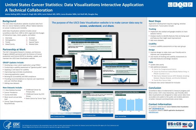
U.S. Cancer Statistics Data Visualizations Tool
The USCS tool uses geographic information system (GIS) technology, data visualizations, and interactive maps to help users explore, use, and understand cancer data. USCS combines cancer registry data dating back to 1999 from CDC’s National Program of Cancer Registries and National Center for Health Statistics, and the National Cancer Institute’s Surveillance, Epidemiology, and End Results Program. The system currently contains data from 24 million cancer cases that users can access to create interactive data visualizations and display cancer incidence and mortality data across time.
GRASP Provides Expertise in Data Visualization
USCS is managed by CDC’s Division of Cancer Prevention and Control (DCPC). To improve the capabilities and user experience of the tool, DCPC partnered with the Geospatial Research, Analysis, and Services Program (GRASP) in 2017 for their expertise in data visualization and interactive mapping technology.
In the early phases of development, GRASP performed extensive user experience testing to ensure the interactive application was understandable and met user needs. DCPC and GRASP developers organized cancer surveillance data into eight modules to make interpreting and working with the data easier. As a result, users can access the latest official federal cancer data by cancer type, state, demographic category, and year to create and export presentation-ready trend graphs, maps, and tables.
GRASP and DCPC add up to 1.5 million new cancer cases each year to the database. They continue to improve the tool with new design features, such as mobile device features that make it easier for users to access and share on social media, and a snapshot export function to help states quickly and effectively communicate information to their partners and communities. CDC scientists encourage decision makers to use the USCS tool to examine and report cancer statistics to inform cancer control planning and track progress.
Cancer Data for Action
The ease of use and accessibility of the USCS tool supports public health efforts to advance action in cancer control and prevention. The interactive maps, graphs, and tables in the tool help researchers identify emerging cancer clusters, understand community screening needs, and focus surveillance efforts. The tool helps states present data clearly to their communities and enables policy makers to direct funding and resources appropriately. As the go-to source for national cancer data, the USCS tool will continue to help CDC work with states and partners to understand trends and patterns, which is essential to cancer prevention.
Learn more about the U.S. Cancer Statistics Data Visualizations tool.
Cancer is the second leading cause of death in the United States, exceeded only by heart disease.
Data visualization is a way of presenting complex ideas of place and health in a graphical form so that it is easier to understand and process.
Data sources:
- CDC National Program of Cancer Registries
- CDC National Center for Health Statistics
- Surveillance, Epidemiology, and End Results Program, National Cancer Institute
USCS interactive application dashboard

24 million
Number of cancer cases in database
127,000
Number of views in FY 2018
“The user-friendly tool explains stories behind the numbers and makes U.S. cancer surveillance data more easily accessible to the public and cancer control planners.”
Simple Singh, MD, MPH – Epidemiologist, Division of Cancer Prevention and Control (DCPC)